Auto Earn
OKX is a crypto trading platform. Auto Earn, a handy feature that helps users generate passive income on idle funds by automating investments in low-risk products, struggles with a conversion rate at 0.5%.
As the project's design lead, I repositioned the feature's to appeal to the broader user base of crypto newbies, encouraging them to activate auto-earn as their first purchase at OKX.
By remapping user entry points and redesigning instructional materials, the team achieved a 3X increase in conversion after the first 2 weeks of launch, resulting in over 20K new users.

I identified users with interest in financial products but have made zero purchases are our target users.
Through playing around with Amplitude (a data analytics platform), I discovered a fascinating group of crypto newbies who have never made a purchase contributed to 73% of total monthly unique views on the Earn landing screen.
The Earn landing screen is an all-in-one portal to accessing OKX financial products. My hypothesis was this user segment has an interest to purchase financial products from OKX, but just did not know where to start.

The existing onboarding experience made Auto Earn seems more complex that it really is.
I invited 2 designers to conduct a round of heuristic evaluation in the early design process. We learned that the use of visual does not differentiate Auto-earn from the remaining Earn products’ logic of depositing assets to earn rewards. The title also did not provide extra information about Auto-earn’s benefits.
Even though flexibility is highlighted to assure users of their fund liquidity, the lack of guidance on deactivation could be an obstacle for risk-averse users. While Auto-earn supports 140+ digital currencies, it creates cognitive load for users to memorise which crypto currencies they own.

Auto Earn was nested in an asset management feature omitted by crypto newbies.
Upon reviewing with 3 OKX users that fall into our targeted user segment, I learnt that the Auto-earn entry point was inaccessible. It was located deep within a feature called Grow wallet, a destination to track performance of purchased products.
Hence, for people who have never purchased financial products from OKX before, they would be less intended to visit the Grow Wallet, and therefore the Auto-earn entry point.

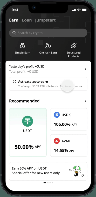
I introduced an entry point to Auto Earn on the Earn landing screen after comparing with a few other alternatives.
Supported by the insights found in the user segmentation analysis earlier, the Earn landing screen is evaluated to have the highest visibility to target user group.
The home screen's high page views make it a crucial funnel entry point. However, optimizing real estate distribution with other feature promotions across OKX's diverse offerings raises questions and could potentially delay the first iteration.
While Simple Earn landing (a nested product categories within Earn) attracts users with a strong intent to purchase financial products due to its straightforward deposition and withdrawal rules, it faces a significant drop-off rate.
The funding wallet, frequently visited by our target users, primarily sees actions like asset withdrawal, deposit, and history overview with a 6% average clickthrough rate. In contrast, the Earn landing redirection has a mere 0.24% clickthrough rate, indicating users view the funding wallet for basic account management. Placing Auto-earn here would contradict their mental model.

I articulated Auto Earn's unique benefits through a joint collaboration with content and visual designers.
Overall, we created a more engaging content to shift from explaining the product logic behind to outlining the benefits and ease of activating Auto-earn. Tab is introduced to segment information into Overview and FAQ for better scannability. We also included the exact step needed to deactivate in hope to build trust with our users.
Although one of our early intentions was to showcase major cryptocurrencies supported by Auto-earn in hero visuals, the feature is subject to market conditions. Consequently, we cannot guarantee the consistent inclusion of the same set of cryptocurrencies over time. It would be misleading to portray popular currencies in the visuals.

Reminding users of unrealized earnings through the use of dynamic content in the entry point.
Collaboration with backend engineers enabled us to display the amount of idle funds in users' digital wallets. Leveraging this dynamic content, we aimed to create a more relevant experience to encourage users to capitalize on the opportunity and earn more.

It's always the small stuff that makes a difference. In this case, it is the debate of tag vs toggle.
Throughout the design exploration, I decided to replace the toggle component with a status tag. This change condenses real estate usage, preserves status indication, removes touch area ambiguity, and positions Auto-earn not as a utility but a desired feature.

I delivered a cross-platform solution to capture crypto newbie users on Android, iOS, and web.
Upon delivering high-fidelity User Interface designs and content variations, I also prepared the complementing dark mode and website designs to create a unified Auto Earn experience.

Impact
By remapping user entry points and recreating instructional materials, the team achieved a 3X increase in conversion after the first week of launch, resulting in over 20K new users.