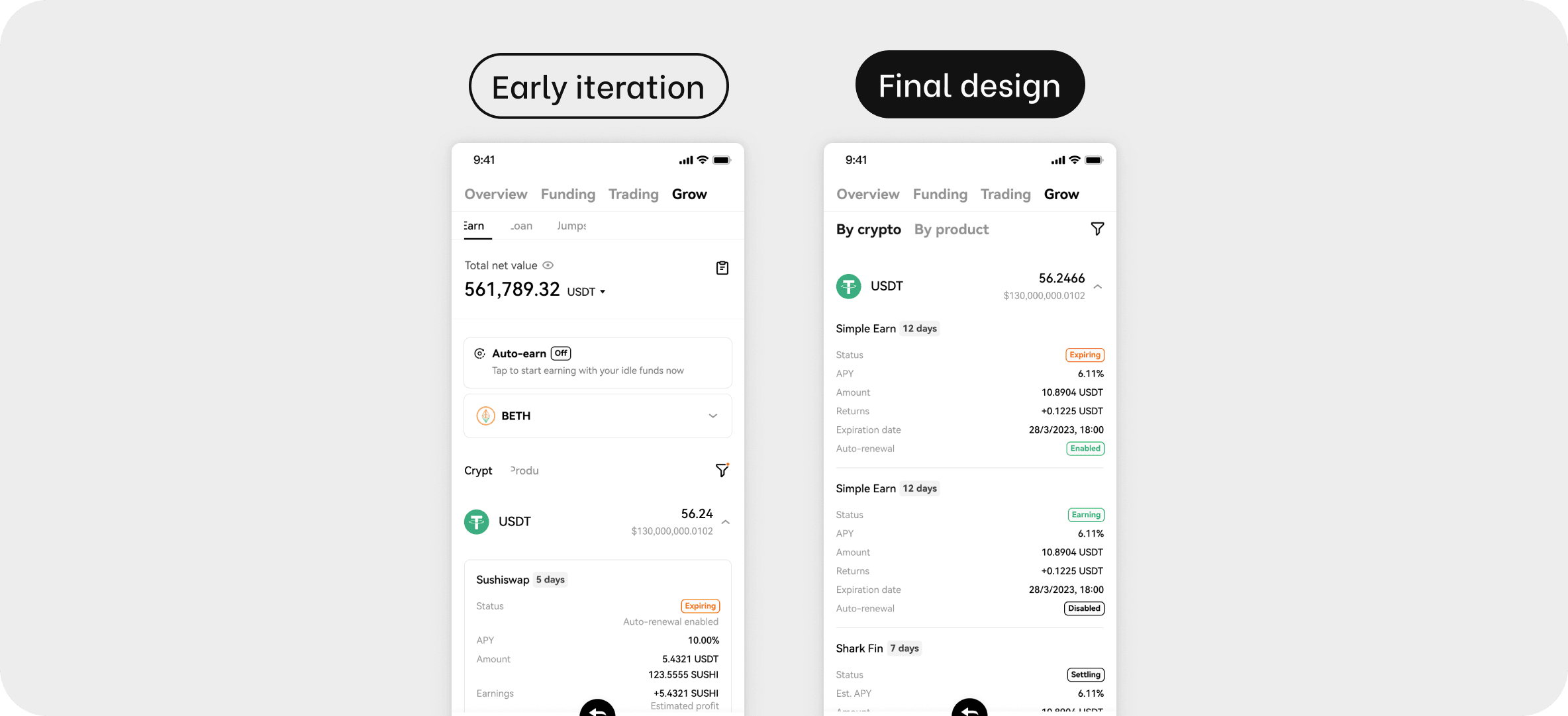

Previous design burdens user’s synthesis and memorial skills
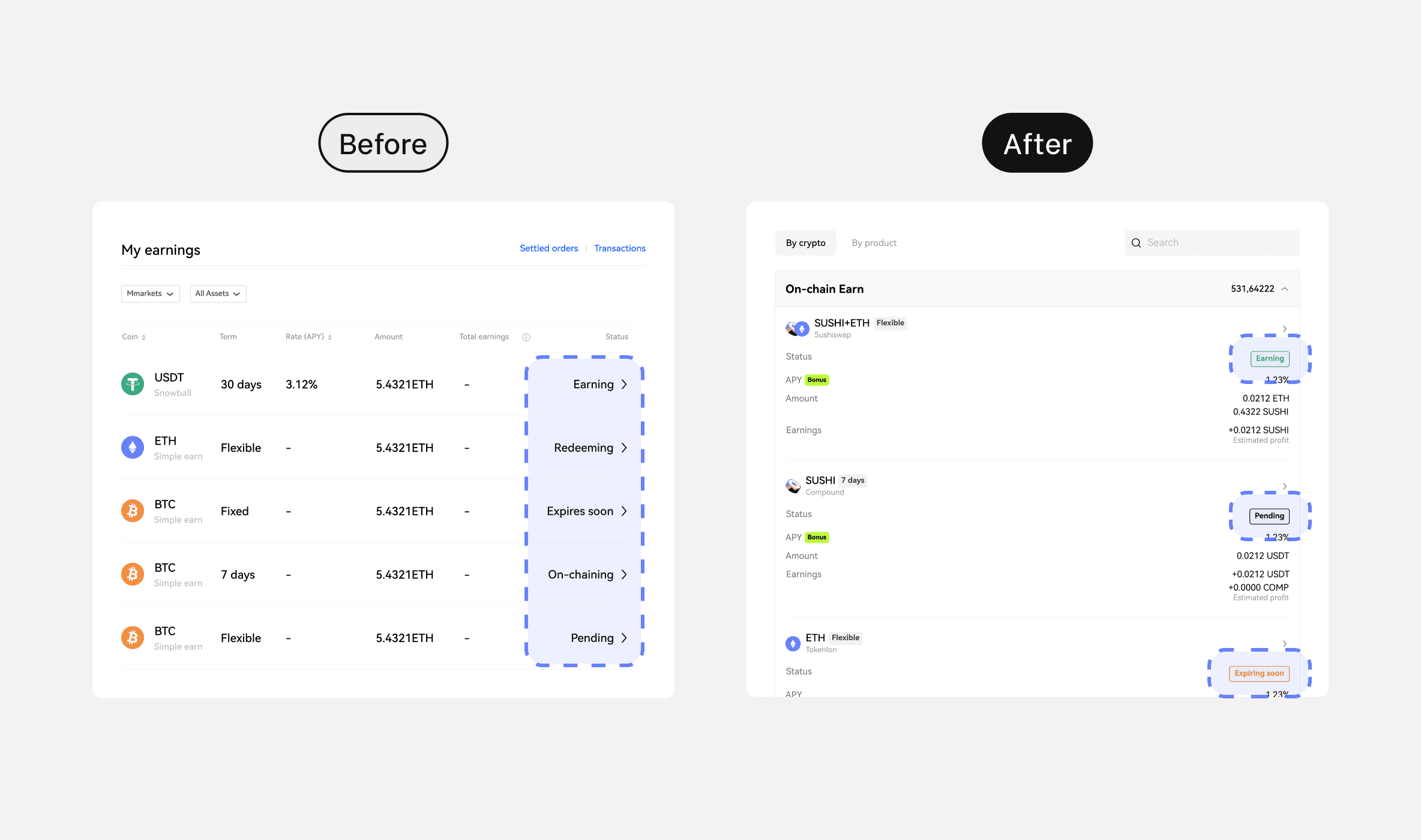
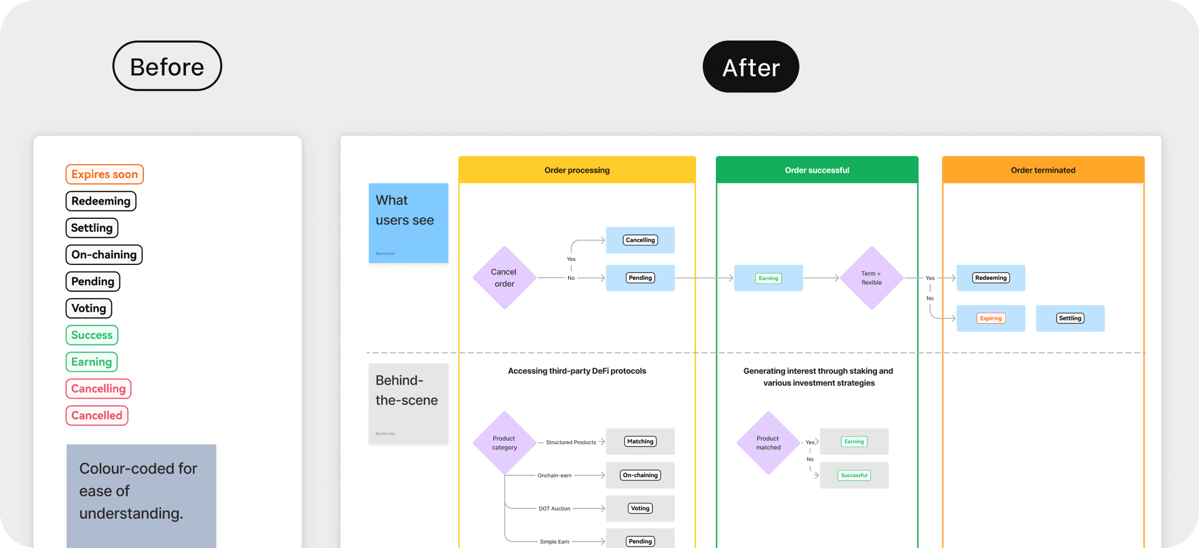
Both product terms and status are displayed as text labels. The lack of contrast in colours and forms made the differences between products non-distinguishable.
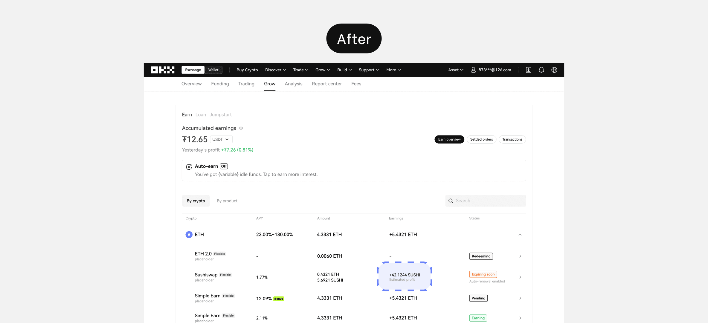
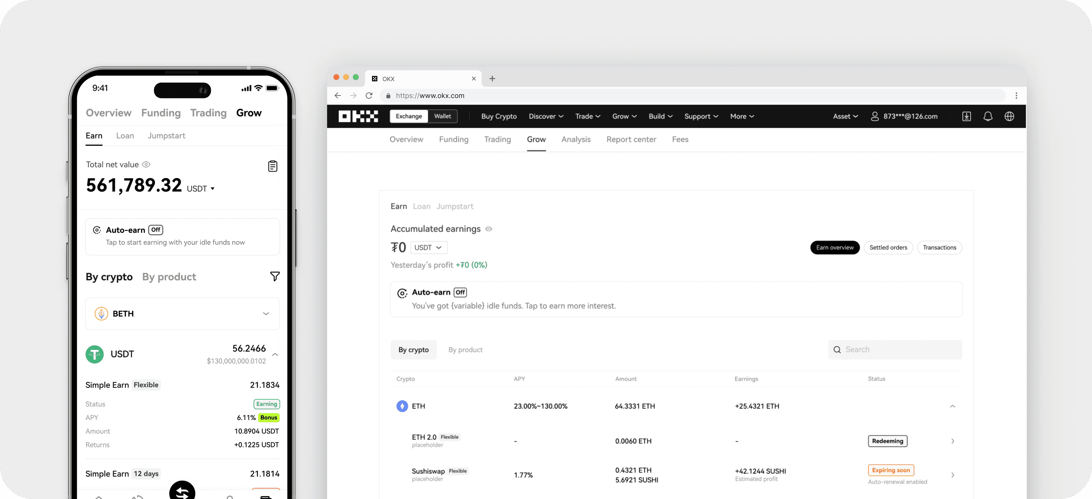
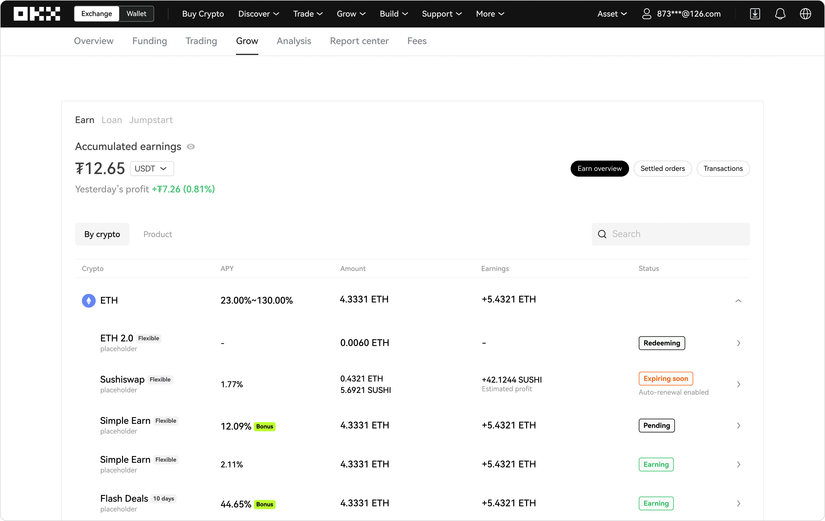
I optimized scannability by replacing text labels with tags, utilizing colors to differentiate between statuses. Term tags, serving as supplementary information, are presented in a subtle branded grey hue.